


An's Dry Cleaning Kiosk Design
Creating a kiosk to reduce the time it takes to order from the best ice cream shop across the U.S.!
Role
UX Researcher + UI/UX Designer
Team
4 Designers (2 Digital, 2 Physical)
Duration
May 2025 - June 2025
CONTEXT
Why An’s Dry Cleaning?
An’s Dry Cleaning is an award-winning gelato shop in San Diego with a 4.7/5 rating from over 1,000 reviews. Its popularity has led to:
30+ minute waits that deter customers
Long peak-hour lines that overwhelm staff
High ROI potential if wait times are reduced via a kiosk
…and as a returning customer of An's Dry Cleaning, we wanted to work in creating a solution that addresses these issues.
The Challenge:
Despite its success, An’s has no in-store kiosk and suffers from:
Lines that wrap around the building
Waits of up to an hour
Customer drop-off during peak hours
USER RESEARCH
User Research Summary
To understand how we might reduce wait times and enhance customer experience at An’s Dry Cleaning, we explored both industry and user expectations through secondary research, community insights, and competitive analysis.
Market Research:
Kiosks reduce wait time by ~40%.
Customers prefer autonomy, speed, and less human interaction.
Primary Research:
😒
75.1% of users cite long wait times as a major pain point.
🙄
61.8% would use a kiosk to reduce wait.
😔
The flavor tour is memorable but causes bottlenecks.
😑
Constant complaints about the repetitive long wait times.
😣
😤
“It's hard because it's so busy…so now it's like we try to be strategic about when we get here”
- Local San Diegan
Take away:
Locals who come often shouldn’t have to strategize when to come to An’s to enjoy their experience. All customers should be able to enjoy their experience.
“Sometimes I just want to order my cone and just, like, get out of here”
- Local San Diegan
Take away:
Locals who come by often shouldn’t have to wait in line for the flavor tour when they already know what to order
In analyzing user research, we developed two main user personas that best embodied our target audience’s needs, painpoints and goals.
User Interview Testimonials
I’m not going to wait down the street when I could you go somewhere else or just come back when when there's not a long line.
Motivations
Interesting and unique flavor choices
Convenient and accessible
Friendly atmospheres
Supporting locally owned businesses
Needs
A convenient way to try new seasonal flavors without waiting in line
Wishes she could pre-order or regular customers could order quickly
Wishes the pints were smaller or had split flavors
Pain Points
Gets annoyed by indecisive people on the flavor tour
Will opt for buying ice cream at the store, but she’d rather support local business
Doesn’t want a whole pint because she likes to mix and match flavors

Jane
Frequent Customer
24 years old
Jane is a San Diego local and currently living in the North Park area. She likes to stop by An’s on her way back home from work and is familiar with their recurring flavors, but always excited for the seasonal ones.
I saw it on the news a long time ago and I tried to come one evening, but the line was all the way around the corner.
Motivations
Flavor options for the whole family
Entertaining for the kids
Good quality desserts that are worth the money
Needs
Some way to keep his kids entertained and excited while in line
Ice cream flavors that satisfy the whole family
Wants to buy a pint to take home of his favorite flavors
Pain Points
Kids get antsy after waiting too long
His family want to try every flavor and take a long time to make a decision
Can only visit on weekends which are always busy
Marcus
First Time Customer
36 years old
Marcus works in the San Diego area and likes to take his kids to fun places on the weekends. He saw that An’s won best ice cream in the nation, so he thought it would be cool to take his family to try it.

After compiling user interview data and key insights, we were able to better understand the problems that customers face when visiting An's Dry Cleaning. Our analysis led us to condense the issue into 2 major pain points in need of address:
Pain Points to Address
Overwhelming Flavor Tour Creates Bottlenecks
Customers enjoy the flavor tour, but during peak hours, it adds 2–5 minutes per person, drastically increasing wait times.
Long Lines Hide the Storefront & Deter Newcomers
Customers in line can't see the entrance or menu, which reduces walk-ins.
Some leave the line due to unclear wait time expectations.
Opportunity Areas
Optional Flavor Tour Mode
Allow new users to view a virtual flavor tour via the self checkout kiosk with descriptions and photos
Provide a scrolling menu option for returning customers who already know what they want
Self Checkout Kiosk
Install a kiosk for customers who just want to stop by for ice cream and order right away instead of trying all flavors
How might we streamline the ordering process to handle peak crowds more efficiently while keeping the experience fun and accessible?
IDEATION
After defining the pain points and user persons, we worked on creating some goals:
Keep the experience fun, fast, and accessible
Align visuals with An’s branding
So we brainstormed and mapped out an example of the preliminary information architecture through which an important frame of our product would be structured.

I created low-fidelity sketches of the digital kiosk to put together our potential ideas and envision the core features of the application. These included the Home Page, an Ice Cream Selection Page, Merchandise, Nutrition (which we later removed to narrow our project scope), and Checkout.

ITERATION AND USER TESTING
Next Steps
After sketching the initial lo-fis, we created mid-fidelity wireframes to develop flows, build our vision of this kiosk, and conduct user testing. During this process, I took ownership over the Home Page, Dietary Restrictions, Payments, and Checkouts, ideating features that would enhance a customer's journey of having an easy and quick ordering process.
Hi Jimmy!
Welcome to
Continue
An’s Dry Cleaning
Dietary Restrictions or Allergies?
Search
Continue
Canvas
Lorem ipsum dolor sit amet consectetur. Suspendisse scelerisque ut nibh at accumsan venenatis pellentesque volutpat quisque. Sit in quis consectetur accumsan orci fusce dignissim ultrices in. Convallis gravida elementum bibendum mattis.
Select
Ice Cream
Merch
GF
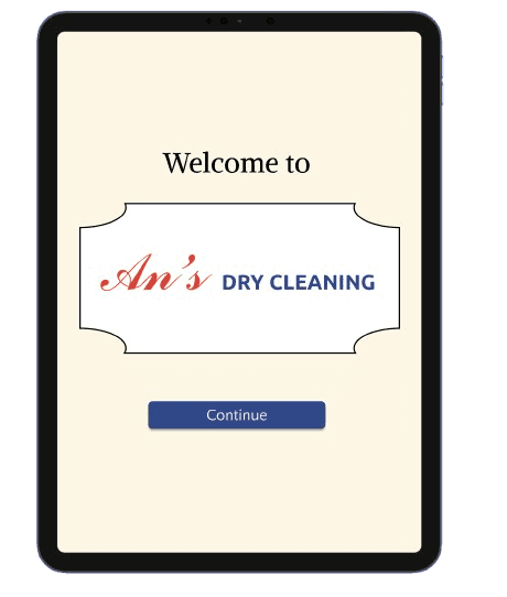
I designed the home screen to feel simple and welcoming. Adding the user's name helps make the experience feel more personal, and the clear “Continue” button at the bottom keeps things consistent with most features.
An's T-Shirts
Select
Ice Cream
Merch
Select a size
Description
$27.00
1
Pay and Place Order
Order Summary
Subtotal
Sales Tax
Total
$13.20
$12.00
$1.20
Pay
Complete
Thank you
Jimmy!
#780

For the merch and checkout screens, I focused on keeping things straightforward and easy to follow. The merch page lets users quickly choose a size and quantity without feeling overwhelmed. On the checkout screen, I made sure the total is clearly shown with a big, easy-to-tap pay button. The final screen gives a clean confirmation with a QR code so customers can just scan and go.
🧠 What We Learned from User Testing
Users had trouble finding specific flavors; many clicked through each one.
Some didn’t realize an item was added to their cart, leading to uncertainty.
Users were confused by the wording “add a second flavor.”
The merch section lacked clarity in size/color selection.
There was not a big need need for a personalized introduction or a dietary restrictions page —> cause an unnecessary barrier for users
How can we reduce the amount of barriers it takes for a customer to reach their goals? (ex. reducting buttons, making tasks all on one page)
💡 Key Solutions of User Testing
Added labels to the ice cream selection on top
Item
Item
Item
Item
Item
Item
Item
Adding a popup screen after checkout
Added to cart!
Go to Cart
Changing the wording from “add a second flavor” to “split your scoop” to prevent confusion
Would you like to split your scoop and add another flavor?
Flavor selected: Canvas
Yes
No
FINAL DECISIONS
After finishing up the final decisions, we worked on creating a Style Guide to have a template of the aesthetic of An’s Dry Cleaning to reference in creating the hi-fidelity.
We followed An’s existing branding by using their signature color palette to keep things consistent across digital and physical platforms.
Title 2
48px
36px
Regular
Regular
Alike
Regular
Title 1
64px
Alike
Regular
Heading 2
Quattrocento Sans
40px
Regular
Heading 1
Quattrocento Sans
32px
Regular
Heading 3
Quattrocento Sans
36px
Heading 2
Quattrocento Sans
40px
Bold
Bold
Bold
Heading 1
Quattrocento Sans
32px
Heading 3
Quattrocento Sans
Quattrocento Sans
Quattrocento Sans
Body 1
20px
Bold
20px
Paragraph text
To maintain visual consistency with An’s existing brand, we used Inspect Element to identify the fonts on their website. We found that they primarily use Alike for titles and Quattrocento Sans for body text, so we matched those choices in our kiosk design.
Accent
Primary
Secondary
Light Blue
#76ACDD
Cream
#FDF6E4
Red
#E23D30
Mint
#9EC6A2
Black
#3D3232
Blue
#31488B

We pulled colors directly from An’s website and from observations at the physical store to stay consistent with their brand. Using Inspect Element and photo references, we matched the same exact shades. The final palette blends playful tones with neutrals to keep the kiosk feeling fresh, clean, and fun, just like the shop itself.
The Final Digital Screen Product
The Final Physical Product
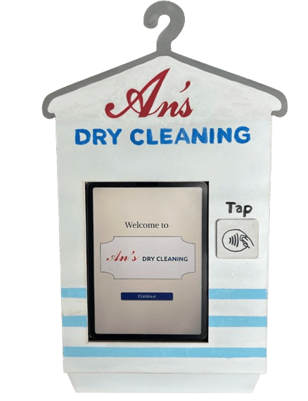
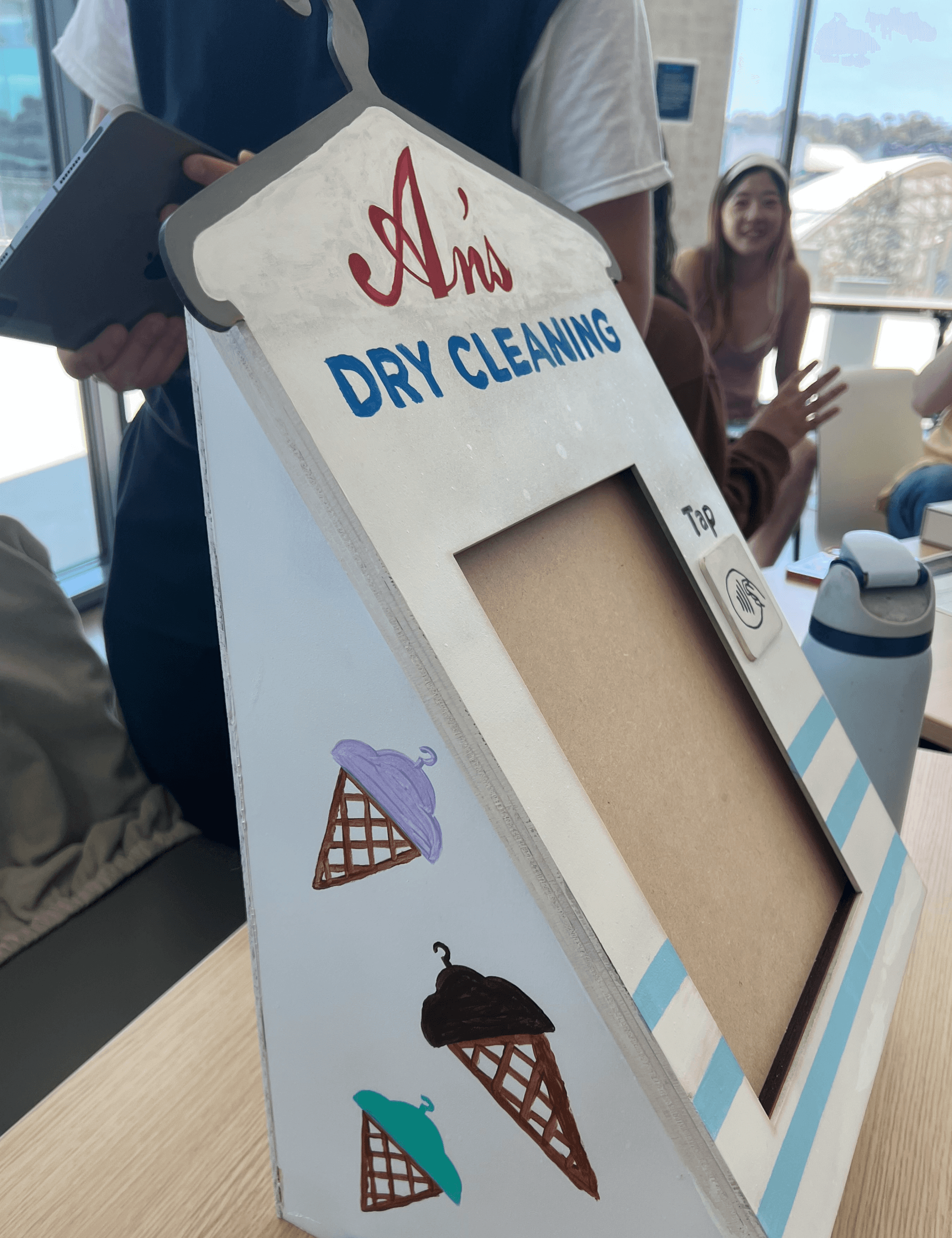
Although I did not work directly on creating the physical product, I contributed ideas to our group about what kind of direction the physical product it should look like. We visited the store in person located at University Heights to observe where this kiosk would most make sense. We worked on iterating on our ideas as a whole to fully understand how to integrate this product into An’s Dry Cleaning.

REFLECTION
What I Learned...
This project taught me a lot about designing for real-world constraints— especially how to balance a fun, branded experience with the need for speed and usability during busy hours. One of the biggest challenges was narrowing down which features to prioritize, especially when we had a lot of great ideas from research.
Proudest Moments...
I’m proud of the thoughtfulness we brought into making the kiosk feel like a natural extension of An’s Dry Cleaning. From matching typography and colors to testing and refining small details like button labels, we were really intentional in every part of the process.
Next Steps...
If I had more time with my team, I would definitely want to explore how we could personalize the kiosk for returning customers. Overall, this project gave me a better understanding of what it takes to design something both delightful and efficient under real constraints.
Thanks For Reading! :) hope you had gelato’ fun
Let's get to know each other! 😊
powered by matcha 🍵
Made with <3 by Arwen © 2026