




Instagram's "Free?" Feature
"Free?" — a concept feature that helps teens reduce passive screen time by creating a reason to actually go offline.
Role
UX Researcher + UI/UX Designer
Team
4 Designers
Duration
April 2026 - June 2026
CONTEXT
Why Instagram?
Teens already spend a significant portion of their daily screen time on Instagram. This makes it the most realistic platform to meet them where they are. Instead of introducing a new app, embedding this feature within Instagram lowers the barrier to adoption and fits naturally into existing social habits.
The Challenge:
Teens want to hang out with friends in real life, but the coordination process is awkward and high-effort. There's no clear way to signal availability without the social risk of being ignored or having to over-commit to plans.
No passive availability signal —> you have to actively reach out to know if someone is free
Group coordination is chaotic —> existing group chats make spontaneous planning messy
Social friction discourages initiation —> teens avoid starting plans because of fear of rejection
USER RESEARCH
User Research Summary
To understand how teens experience screen time and what actually influences their behavior, we conducted interviews with six participants ages 9–17. Our analysis focused on the four teen participants (ages 13–17), as they showed the most consistent and designable patterns around self-directed screen habits.
Primary Research:
🕐
Daily screen time ranged from 7–13 hours, mostly unintentional scrolling
😮
Every teen participant ignored or actively bypassed reminders and limits
😔
Teens are aware their usage is excessive, but awareness alone doesn't lead to behavior change
😐
What actually pulls teens offline is external structure — friends or obligations
🫤
😵💫
"I go to bed at 11pm, start scrolling, and then it's 2am. It feels like time traveling."
- Royce, High School Senior
Take away:
Teens lose time to scrolling unconsciously. The problem isn't a choice to scroll, it's that stopping requires effort the current design doesn't support.
"(I would stop if…) there was actually something to do…"
- Aiden, High School Sophomore
Take away:
Teens consistently named real-world social plans as the primary source that gets them off their phones. A solution that leverages this existing behavior is more realistic than one that adds another ignored notification.
User Interview Testimonials
After compiling user interview data and key insights, we were able to better understand the problems that teens face when "doomscrolling" online. Our analysis led us to condense the issue into 2 major pain points:
Pain Points to Address
In-app interventions fail
Timers, trackers, and break prompts are snoozed, bypassed, or ignored by every participant
Social coordination is high-friction
Teens want to hang out but don't have a lightweight way to signal availability or initiate plans
Opportunity Areas
Design for external pull, not internal discipline
The solution should create a reason to go offline, not just a reminder
Surface availability passively
Let teens show they're free without having to cold-text friends and risk being ignored
How might we design an experience for teens aged 13–17 that helps reduce mindless scrolling and encourages them to engage more fully with life beyond their screens, without relying solely on their self-control and willpower?
COMPETITIVE ANALYSIS
Market Research
We looked at four existing tools to understand what's already out there and where the gaps are within current used tools by teens:

Already has passive activity signals (last active status) and teen protections but nothing connects "you're free" to "go hang out."

Snapchat's Snap Map
Shows where friends are real-time, but location ≠ availability. There's no way to signal you actually want to hang, just that you're somewhere.

Apple Focus Status
Great for signaling "I'm busy" but has no equivalent for "I'm free" and doesn't prompt any real-world action.

Discord's status system
Communicates expectations well, but statuses often create pressure and don't translate offline
The gap across all of them: no existing feature combines availability signaling + social coordination to actually get teens off their screens.
IDEATION
Information Architecture
Flow 1 — Setting a "Free" Status
Teen opens Instagram → taps availability button → selects free now / free later / busy → optionally picks activities they're down for → status becomes visible to close friends who have also shared their status

Flow 2 — Group Hangout Coordination
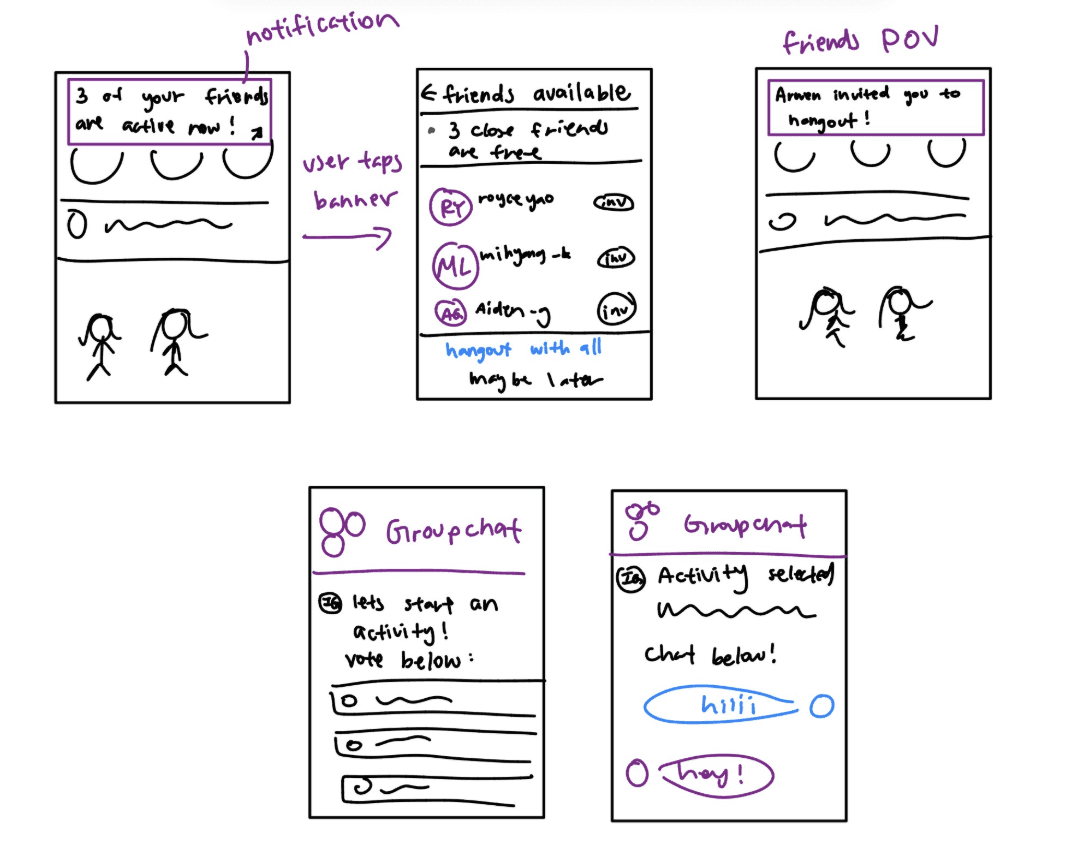
Teen sees "3 friends are free now" prompt → taps to create a group chat → invite sent to free friends → friends accept or ignore → if accepted, group chat opens for coordination → if no one accepts within 10 minutes, chat disappears

I created low-fidelity sketches to put together our potential ideas and envision the core features of the application.
FROM LOFI TO HIFI
Next Steps
After mapping our information architecture and sketching lo-fi flows, I took ownership of the poll-based group chat feature, specifically the activity selection and friends status screens. My main focus here was on making hangout coordination feel lightweight and social, not like another task to complete.
The mid-fidelity screens I designed covered four key moments in the flow:

Activity Selection (Default State)
A scrollable grid of activity tiles lets users signal what they want to do in the moment
Added a "Skip" button to keeps participation optional + reduces pressure that usually stops teens from initiating plans at all
Activity Selection (Selected State)
Selected tiles get a blue border highlight
Gives users immediate visual confirmation of their choices
The CTA updates to reflect how many activities are selected ("Continue with 3 activities")
Users always know what they selected before committing
Friends Status
Filters close friends by shared activity interests
Shows the people most likely to want to hang out
A group chat prompt at the top pushes toward social action right away
Individual Message are still there to preserve a lower-stakes option for 1-1's
Hang Out Group (Pending Invites)
Users see a live invite status card for each friend
A 10-minute auto-disappear timer is shown at the bottom
If no one accepts, the chat disappears
Keeps the feature spontaneous —> addresses the social friction from our research
🧠 What We Updated Based on Feedback
After our first round of user testing, we identified that the mid-fi screens felt visually inconsistent and some flows were hard to follow without guidance. For our second round of testing, I updated the designs to:
Increase visual consistency —> unified spacing, type styles, and component styling across all screens so the feature feels like a real part of Instagram, not just a prototype
Full high fidelity on key interactions —> added real button states, transition cues, and a working prototype so testers could explore the flow by themselves naturally
Clarify the group chat entry point —> early testers weren't sure how the group chat connected to the activity selection, so we made the clarified the handoff between screens

USER TESTING
Methodology
To validate our two prototype directions, we conducted think-aloud user testing sessions with 4 teen participants ages 15–17. Each participant was walked through both Prototype A (poll-based group coordination) and Prototype B (Reels-based activity discovery), then asked to reflect on which felt more natural and why. We wanted to see where they got stuck without guiding them through it.
What we found
The results were clear: all participants preferred Prototype B.
Prototype A:
Participants liked seeing friend availability on profiles and being able to create groups quickly.
But the poll format was not effective
A participant called polls "passive" and said people ignore them in real life. M
Participant 2 worried the feature would replace actual social initiative.
Without prompting, most participants didn't understand what the poll was for or how to move through the flow.
Prototype B:
Participants responded positively to being able to see what an activity actually looks like before committing
Participant liked that it surfaced suggestions based on conversation history
Aiden liked being able to share directly to friends without extra steps. T
The main critique was that location recommendations might only account for one person's proximity rather than the whole group's
Personal Reflection
The biggest takeaway for me:
The format of a feature shapes whether teens will engage with it at all
Polls are not bad, but the interaction felt like something adults designed for teens rather than something teens would actually use
Reels helps build better connection, which made the whole feature feel less like a new thing to learn and more like an extension of what they already do.
Point of View
All 4 of our participants preferred the Reels-based prototype because it was more interactive, more visual, and required less mental effort to engage.
This aligns directly with our core goal: reducing the friction between "I'm bored on my phone" and "let's actually hang out." A feature that feels effortless to use is one that might actually get teens offline.
So we fixed our designs to:
Focused more on the reels feature instead of polls

Gave more clarity on who was active and who was not

FINAL DECISIONS
The Final Digital Screen Product
REFLECTION
What I Learned...
The biggest thing I learned from this project is that the format of a feature matters just as much as the feature itself. We spent a lot of time early on designing the poll flow, and it wasn't that it was a bad idea, it just didn't fit how our user base would actually interact. Watching a participant dismiss polls in testing because "people just ignore those" was a good reminder that designing for a user group means actually understanding their habits. You can solve the right problem with the wrong interaction model and still not target the true problem.
Proudest Moments...
I'm proud of how intentional we were about staying within Instagram's design brand guidelines. It would've been easy to just build something that looked like a new app added on top of Instagram, but we kept pushing to make our extension feel apart of the app.
Next Steps...
If I had more time with my team, I would definitely want to explore how we could extend this for every user group. I'd also want to test with a wider range of teens, especially ones who are less socially active, since our participants were pretty comfortable initiating plans already.
Thanks For Reading! :)
Let's get to know each other! 😊
powered by matcha 🍵
Made with <3 by Arwen © 2026