

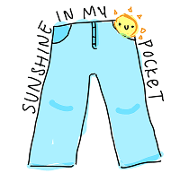
Sunshine In My Pocket - Outfit Generation
Combining weather with style preferences to generate outfit ideas, letting users browse options, save favorites, and build a closer-to-personalized closet over time!
Role
UX Researcher and UI Designer
Team
4 Designers
Duration
May 2024 - June 2024
CONTEXT
Inspiration and Addressing the Problem:
After recognizing the limitations and shortcomings of existing weather apps and wanting a better solution, our team was set on creating a new weather and outfit generation app. As students with demanding schedules, usually requiring prolonged outdoor activities, we envisioned a tool that not only delivers reliable weather forecasts but also seamlessly generates outfits tailored to these forecasts.
USER RESEARCH
User Research Summary
To understand how we might address these problems, we explored both industry and user expectations through secondary research, community insights, and competitive analysis.
SWOT Analysis
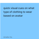
Strengths
Weaknesses
Opportunities
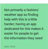
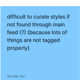

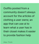


Strengths
Weaknesses
Opporotunities

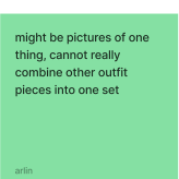


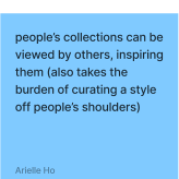

Strengths
Weaknesses
Opporotunities



SWOT Analysis Key Insights
🤔
Inspiration is easy to find; “what should I wear today?” is still hard.
🙅♀️
Community outfits don’t map to what users actually own.
⚠️
Weather apps are strong at context, weak at style.
🙌
Users want guided curation, not more content.

Based on secondary research + competitive analysis, we wrote these as hypotheses to validate with primary research.
Pain Points to Address
Decision fatigue
Users struggle to convert weather + personal style into a confident outfit quickly
Inspo-to-closet gap
outfit inspo doesn’t match what users own, and setup/cataloging is time-heavy
Opportunity Areas
Closet and weather aware styling
Personalized outfits using what you own
Low-effort personalization
Quiz + closet picture capture + feedback
How might we create an application that integrates accurate weather forecasting with personalized outfit recommendations using a user-centric intuitive design?
IDEATION
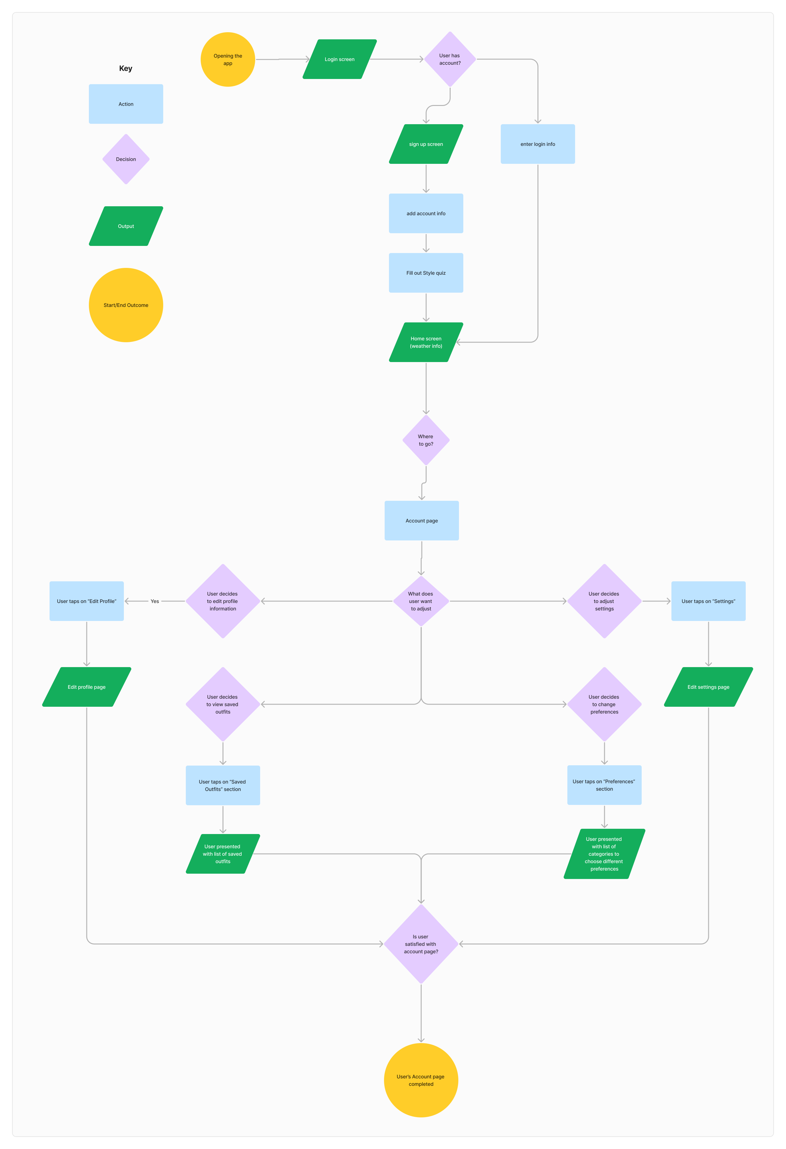
After defining the pain points, we brainstormed and mapped out an example of the preliminary information architecture through which an important frame of our product would be structured.
We created low-fidelity designs to put together our potential ideas and envision the core features of the application.
Home Page
logo
username
password
log in button
forgot password
sign up
Number/Email
Full Name
Username
Password
Reenter Password
logo
sign up
Instructions
welcome text
Next
style
style
style
style
style
style
style
style
style
style
style
style
temperature
generated
outfit
acc
closet
social
weather description / recommended clothes
Mascot
Selecting Outfits

Selecting Outfits
Clothing
Clothing
Clothing
Post!
<-
Are these the photos you want to post?
Account info
post
search
post
comment
react
closet
social
acc
camera
camera roll
saved outfits
<-
Clothing
Clothing
Clothing
Clothing
Clothing
Clothing
Clothing
Clothing
Clothing
Clothing
Clothing
Clothing
Clothing
Clothing
Clothing
Clothing
Clothing
Clothing
<-
Like
Account Page
Profile
Picture
Account Name
Followers
Following
Post
Post
Post
Post
Post
Post
Post
Post
Post
settings
closet
social
acc
Style Preferences
Saved outfits
Language
Brightness
Privacy
Log Out
Profile
Picture
Account Name
<-
Edit
<-
Clothing
Clothing
Clothing
Clothing
Clothing
Clothing
Clothing
Clothing
Clothing
Clothing
Clothing
Clothing
Clothing
Clothing
Clothing
Instructions
Confirm
style
style
style
style
style
style
style
style
style
style
style
style
search
ITERATION AND USER TESTING
Next Steps
After sketching creating the low fidelities, we want to conduct a quick user testing to see if our designs were feasible when users actually used the application. We created a Google Form which we filled ourselves to take accurate and consistent notes.
🧠 What We Learned from User Testing
The Closet/Catalog distinction wasn’t clear
Users confused the two because they looked similar and the labels didn’t match their expectations, which slowed down task completion.
Users needed more guidance and structure when browsing
Participants wanted faster ways to find specific items, suggesting the Catalog needed filters/search and stronger calls-to-action
Navigation had a lot of information/ hard to “find where to go”
Several participants struggled to locate functions quickly, showing that the information architecture and signifiers needed to be more obvious and consistent
💡 Key Solutions of User Testing
Clarified the “My Closet” vs “Catalog” mental model
Renamed pages to My Closet (items you own) and Catalog (browse to add)
Added short helper text + visual differences so users immediately understand the difference
Made the Catalog faster to browse and add items
Added search + filters (ex: category, color/style) to reduce scrolling
Added a clear “Add to My Closet” CTA with confirmation feedback
Reduced navigation friction and “where do I go?” moments
Consolidated core actions into a more predictable navigation structure
Reduced unnecessary steps to reach key tasks (adding items, saved outfits, posting)
FINAL DECISIONS
After gathering key insights and learning how we could make our application better, we worked on getting into the REAL designs by creating a branding guide for our high fidelity.
We wanted our brand to be fun, bright, and bubbly. We chose colors that reminds us of the weather which consisted of blues and oranges.
Sunshine In My Pocket

Colors
55 %
25 %
10 %
10 %
Fonts
Vanilla Caramel 28 pt
Vanilla Caramel 24 pt
Vanilla Caramel 20 pt
Vanilla Caramel 16 pt
Vanilla Caramel 16 pt
Balsamiq Sans Regular
Balsamiq Sans Bold
Balsamiq Sans Italic
Balsamiq Sans Bold Italic
The Final Digital Screen Product
Challenges
Not enough time to implement all functions into the app
Workload got a little harder as we were busy with other school tasks
Some users found the icons to be too small
Camera feature was confusing for users to use
Next Steps
Have more time to gather information from a diverse group of users for their input on the app
More emphasis on the discover page of the app -> making different features, changing the layout, etc..
Emphasis on creating easier steps for user flow
Reflection
Participating in my this project was a fun and challenging experience! I am glad that I pushed myself to joion and participate fully in this project despite juggling around school work.
Some key takeaways:
I learned how to stay dependable in a team even while juggling school deadlines
User testing gave us direction instead of guesses
This project made me more confident in the design process
Thanks for Reading :)!
Let's get to know each other! 😊
powered by matcha 🍵
Made with <3 by Arwen © 2026